Enhance Product Discovery: Best Navigation Tips to Improve UX
What makes navigation an important factor? Have you ever felt that you wanted to reach a particular page on a website but could not or said you got lost? This is where navigation comes in and helps you easily navigate through the numerous pages of the website. Implementing optimal E-commerce Navigation UX helps users easily navigate the website's various pages.
Businesses can improve their overall UX by incorporating simple pathways, smoothly designed menus, and a user-friendly interface. Most of all, a well-structured navigation system easily guides a potential customer through the ocean of products, fostering a positive user experience and increased engagement and purchases.
According to research, only 30% of the users rely on search input, while 70% prefer navigating directly. This blog will discuss the importance of navigation and the rules for designing an effective navigation.
What is Ecommerce Navigation Design?
Ecommerce navigation UX design focuses on creating, analyzing, and implementing effective ways for users to navigate online shopping platforms. This specialized area of navigation design is integral to the success of ecommerce websites, as it directly impacts how users interact with and explore the vast options of products and services.
The primary goal of e-commerce navigation is to provide a smooth and positive journey for users from the moment they enter the site to the completion of a purchase. This involves the strategic use of UI patterns, including links, labels, and other elements, specifically tailored to enhance the ecommerce user experience.
The advantages of an e-commerce navigation UX design are:
- Enhanced User Understanding: It helps users quickly understand the structure of the ecommerce platform, making navigation and product discovery easy.
- Increased User Confidence: A user-friendly navigation offers credibility and authority, which makes users confident about the product, encouraging them to browse and make purchases easily.
- Credibility: The navigation design contributes significantly to the credibility of an ecommerce platform.
The design patterns for navigation UX are diverse and dynamic for e-commerce. Different businesses need different navigation patterns; there is no such thing as one solution that fits all. Each chosen design pattern must be carefully evaluated and tested to ensure it aligns with the ecommerce platform's specific requirements and the target audience's preferences.
Adopting a user-centered design perspective is essential. Understanding online shoppers' distinct preferences and behaviors allows for creating navigation that optimizes the ecommerce platform and resonates with the users, ultimately contributing to a positive and rewarding online shopping experience.
The Importance of Navigation Design
More than 5.5 million apps are on platforms like Apple and Android collectively. Now, think of these maps as the navigation design of each app, determining how easy or frustrating it is for any user to find what they are looking for.
Every product needs a smooth path, whether it's buttons, menus, or dropdowns, for a user to achieve their goals. If this path is confusing or poorly designed, that person might leave and abandon the app. That is why navigation design is crucial it works like a friendly guide, helping them explore and enjoy what an app offers.
In 2001, tech expert Alan Cooper highlighted, "A good design should be crystal clear. Users shouldn't waste time figuring out where things are hidden.”
Here’s why navigation design matters:
Reflects Your Brand: A well-designed navigation system makes a positive impression, shaping how users see the app.
Communicates User Location: Navigation acts as a GPS, which helps you know where you are in the app. It's like a friendly guide saying, "You are here," making your experience smoother.
Provides Access to Information: Navigation is the key to finding your need. A smart navigation system ensures you can easily access the information or features you are searching for.
Good navigation design is not just about buttons and menus; it is about making the user's journey through an app enjoyable and hassle-free.
What are the rules for Designing Great Navigation?
Prioritize Consistency
Inconsistencies in navigation can arise when content does not align with the predefined sections of a website, leading to its separate listing. Alternatively, there are situations where users require quick access to elements residing deep within the website, prompting site owners to add quick links in the navigation. However, some alternative approaches aim to sidestep the practice of making irregular additions to the navigation.
1. Subpages and Landing Pages
Achieving consistency needs transparent decision-making. All navigation elements should display subpage links or none of them. Displaying subpages for specific sections may mislead users, creating the impression that sections without visible subpages lack them. If subpages are not featured in primary navigation, employing consistent secondary navigation across all sections is crucial.
For example, When a visitor hovers over any section in the menu on the Nashville Zoo website, the corresponding subpages for that section become visible.

Similarly, all primary navigation items should consistently link to landing pages or serve as section headers for secondary navigation links. Inconsistencies such as only some items being linked can create confusion among users.
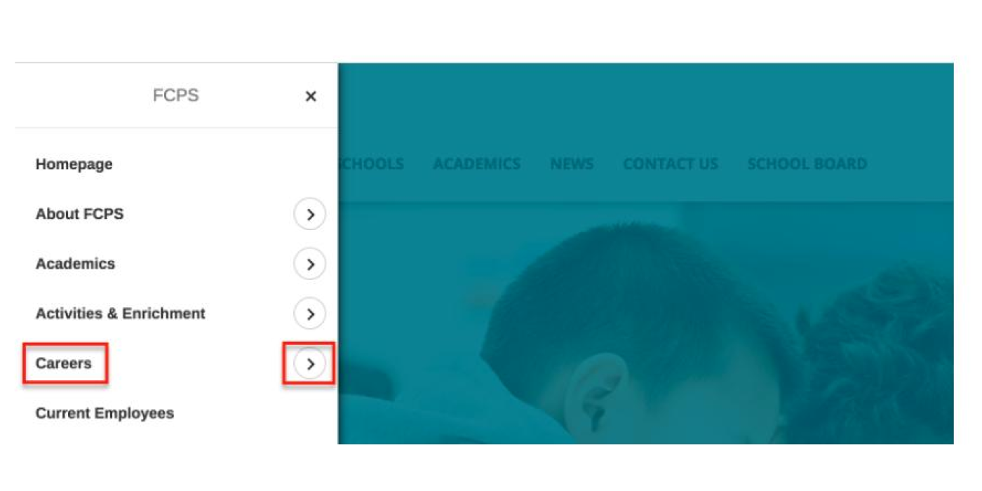
Additionally, when a primary navigation item is a link, clearly indicating the related action through verbiage or visual design is essential. This ensures users understand how to navigate to the desired content. Let’s look at an example: In the Fairfax County Public Schools menu, users can reach the Careers landing page by either clicking on the text "Careers" or clicking on the arrow to explore the subpages.

2. Call-outs and Feature Blocks
Call-outs or feature blocks on the homepage or section landing page may be best for content requiring easier access. These visually appealing elements capture user attention without disrupting the overall site navigation.
3. Breadcrumbs
Breadcrumbs act as effective navigation aids for users arriving from external sources. Ensuring accuracy in breadcrumbs is critical for effective user orientation. While smaller websites with two levels may not necessitate breadcrumbs, consistency is key when implementing them.
By adhering to these principles, websites can establish a cohesive and user-friendly navigation experience, allowing users to explore content with clarity and effortlessly.
Design Clear Interactions
User confusion often arises when visitors struggle to identify interactive elements or anticipate specific actions. To overcome this challenge, it is imperative to design functional and crystal-clear interactions meticulously.
- Clarity through Visual Changes
Visual changes convey the nature of interactions on a website. An example is the smooth transition from an expand icon to a collapse icon, signaling a change and providing users with a straightforward guide on how to undo the modification. The absence of such visual updates may result in users overlooking these crucial changes.
- Use of Labels with Icons
While icons can effectively replace text links, introducing a label significantly reduces ambiguity. For instance, rather than relying on the widely debated hamburger icon, adding a clear "Menu" label alongside it improves user understanding. This practice proves valuable for other commonly used icons, such as "Contact" or "Login."
- Designing Interactive Icons
The differentiation between icons serving as links and those employed for informational or categorical purposes is critical to user understanding. A strategic approach involves assigning the link color specified in the style guide exclusively to icons designed for interaction. Decorative icons adopt a distinct non-link color to maintain clarity.
A study by NNG underscores the impact of varied visual indicators. Users show a 37% increase in speed when locating items within a web page list where color and icon variations complement the text. By implementing these principles, websites can serve user-friendly experiences, ensuring visitors confidently navigate and engage with the intended interactions.
Avoid Deep Navigation
To create a perfect design, aligning the information architecture (IA) and website hierarchy with this goal is crucial. When constructing a sitemap, aim for a "flat navigation" model, enabling users to reach the deepest pages within one or two clicks.
While flat navigation is an ideal solution, it is a misconception to believe that limited short-term memory necessitates short menus. The Nielsen Norman Group advocates for menus that allow users to "rely on recognition rather than recall." Thus, menus should be short enough for easy scanning yet long enough to maintain clarity.
- Limiting the Number of Levels
The site hierarchy defines the number of navigation levels. One or two clicks should quickly lead users to their desired destination with minimal confusion. As the Nielsen Norman Group noted, deeper hierarchies can disorient visitors.
Most websites maintain three or four levels of hierarchy, balancing accessibility and avoiding overly broad navigation. To determine the right number of levels, separate the current hierarchy into different groups and assess whether these groups can be brought next to a higher-level grouping. This may involve:
- Updating section labels
- Creating new sections
- Adjusting how sections relate to each other
Consolidation or removal of content needs to be considered as well. Current trends for truly flat navigation lean towards full-page designs where all pages reside on one level.
- Unique Visual Design for Each Level
Navigation should enable quick scanning, distinguishing the primary, secondary, and tertiary links. Consistent visual design elements such as font styles, sizes, weights, and colors should differentiate between navigation levels. If secondary navigation is present, it should clearly distinguish between parent/child and sibling links while aligning cohesively with the primary navigation.
- Use Location Indicators
Similar to breadcrumbs, location indicators within the navigation assist users in orienting themselves within site, especially when navigating deeper levels. Clear visual cues signify the section a user explores, enhancing overall navigation understanding.
Design for Responsive Compatibility
A good navigation system should be user-friendly on all devices that includes your computer, phone, or tablet. Create a navigation that looks and functions the same way on different devices, or consider having two similar navigations so users don't get confused when switching between their computer and mobile.
- No More Hovering on Mobile
When you hover over a menu on your computer, it shows more options. But this doesn't work the same on phones. If you have something you can click on your computer by hovering, find a way to make it easy for mobile users, too. Have a text link that takes you to one place and a little button you can tap to see more options.
- Design for Each Device
Designing the navigation differently for computers and mobiles is better. Each device is different, and designing for its unique features and screen sizes makes the experience smoother for users. It is like having a separate design for each device to ensure everything fits and feels right.
Conclusion
Designing navigation is a basic step to foster user engagement and convert users into buyers. Navigation emerged as a key factor shaping user perceptions, reflecting brand identity, and ensuring users quickly access the information or features they seek. As users increasingly rely on navigation rather than search inputs, businesses benefit from investing in optimal navigation design.
If you are struggling to create an ideal e-commerce navigation UX or unsure where to initiate this crucial process, Saffron Edge is your trusted partner. Our expertise lies in optimizing websites, explicitly focusing on enhancing the user experience for online shoppers.
Let us guide you in creating an e-commerce navigation design that not only meets but exceeds your objectives, driving engagement and conversions effectively.
Drive Exceptional Growth without an In-House Marketing Team
We drive business growth by optimizing every inbound channel to attract and convert high-quality clients for you
Share with Friends
Biulding Websites For High Conversions
Seamless development services for websites, apps, and platforms tailored for better UX.
Talk to ExpertsSubscribe to our newsletter
Get fresh stories, case studies, and
advice
from successful creators and industry experts.

Subscribe now

Biulding Websites For High Conversions
Seamless development services for websites, apps, and platforms tailored for better UX.
Talk to Experts


