
How To Prepare For Google’s Mobile-First Index

Oct 13, 2025
 7 min
7 min
Google, which you may recognize as a search engine goliath, is at the end of the day a business trying to make profits. And like most successful businesses, they too want to provide their users (searchers), like you and me, with the best experience they can for using their platform.
Since mobile usage all around the globe has witnessed tremendous growth over the past years, it becomes fairly easy to understand Google’s decision to focus on mobile as well.
In November 2016, with their announcement of introducing a mobile-first indexing algorithm to show better search results to their ever-increasing mobile searchers, it generated quite a buzz about the future of mobile and the direction of SEO in general.
But this vague Google announcement created more confusion amongst webmasters than buzz and questions like ‘Does this announcement mean I should only focus on my mobile website?’ and ‘I don’t even have a mobile website, should I get one to increase my overall rankings?’ popped up in the comments soon enough.
Until recently, when Google cleared all the air about their new mobile-first index with an announcement stating that they are commencing their long promised and awaited ranking algorithm shift and have started migrating sites that follow the mobile-index best practices.
For those who are still new to this concept, Google’s shift to mobile-first indexing is actually not how things are admitted or prevented from inclusion in its index, but instead, how things are organized within the index, which is obviously going to be mobile-first from now on.
But the key takeaway of all this is that there still is only one index of your website and it will be heavily prioritized on the performance of your mobile website. So, if you want to get that front spot of Google, getting a fully optimized mobile website along with your desktop website is your best bet.
Here are some factors that will help you rank better in accordance with the new Google’s mobile-first indexing algorithm -
Know your type of site

You need to know what type of mobile website you currently have and set it’s metadata accordingly to let Google crawlers know as well. Usually, all separate mobile websites fall under the category of dynamic serving or separate URLs.
It will help your mobile website get indexed quickly and more often. Like, in a dynamic serving setup, a vary HTTP header must be added to its metadata to hint Google crawlers about your site’s dynamic serving.
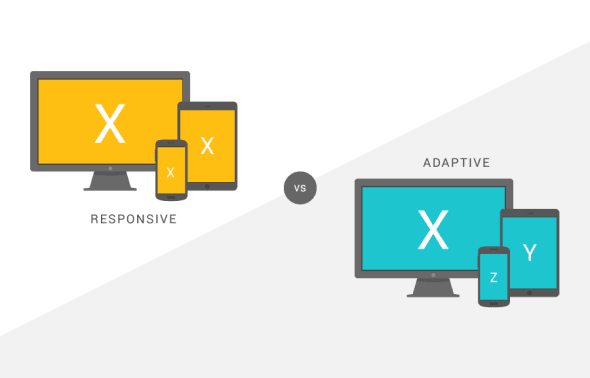
Google prefers that you have a responsive web design instead of having separate URLs for your mobile website because of its crawler friendliness and the ease of sharing it provides to users. Moreover, if you choose to have a responsive web design for your mobile website, you won’t have to alter your desktop website content in any way.
No matter which type of website you choose, using any of the mobile optimization methods require that you let the crawlers know specifically under what category your mobile website falls in, as it will only help your website get crawled and indexed in a better way.
Speed

From July 2018, page loading speed is going to be a major ranking factor for mobile websites and Google is calling it the ‘Speed Update’.
Website performance, according to a Kissmetrics’ study, is the most decisive factor that can result in a good or bad user experience for mobile searchers. Accordingly, optimizing your mobile website for speed should be your top priority for 2018 if you are looking to jump up some places in your search results.
You can use Google’s own tool PageSpeed Insights to analyze and optimize your mobile website’s performance.
Accelerated Mobile Pages (AMP)

Talking about speed, making use of the Google’s AMP project is a nice way to book a spot at the top of search results in the form of carousels. See that lightning bolt on the bottom left corner of the carousels, that denotes that the pages are AMP.
AMP is light HTML pages that take advantage of various technical approaches to prioritize speed and deliver a quicker experience to users by instantly loading content.
If all your desktop website pages are built with AMP HTML, you won’t need to have a separate mobile website to cater to your mobile visitors.
Also, websites that are already using AMP pages enjoy greater Google mobile search results exposure across categories of e-commerce, entertainment, travel, news, recipe sites and more.
If you have a website hosted on Wordpress and want to make use of the extra benefits of AMP, you can install plugins that can help you with the same.
Schema and Rich Snippets

Schema or Schema Structured Data is a semantic vocabulary of microdata tags that you can add to your website’s HTML to improve the way search engines read and display your page in SERPs.
By adding this structured data markup to your website’s HTML, search engines will be able to better understand the content on your website and add a ‘rich snippet’ to your search engine results which can marginally improve CTR as searchers will be able to see better and in-depth information about your website.
With Google pressing webmasters to provide rich information to searchers, I think adding Schema markup to your mobile website now is more important than ever.
If you haven’t yet added schema markup on your mobile website, you can add it with the help of this detailed guide and test its effectiveness by using Google’s Structured Data Testing Tool.
Likewise, if you have a WordPress website you can make use of plugins to add information-rich schema markup to your website’s HTML easily.
Site Structure
 When it comes to SEO, the HTML structure of your website matters. Your website’s technical configuration plays a crucial role in its organic performance and if you are using a dynamic serving or separate URL mobile website, you need to be more careful and double check your website for the following aspects -
1. Hreflang Tags
If your website caters to users of different nationalities, most probably you’ll have your website translated in other languages as well. But how do search engines know what webpage translated into a specific language needs to be shown to a specific user? Through Hreflang Tags.
If you have a ‘Separate URL’ mobile website, make sure that you have placed the correct Hreflang Tags on your mobile website’s HTML to redirect users to a webpage of the correct language.
2. Robots.txt
A website ‘Robots.txt’ file contains specific directives for search engine crawlers to follow when they crawl your website. If you have a ‘Separate URL’ mobile website, then you need to have a separate ‘Robots.txt’ file for your mobile website as well.
The ‘Robots.txt’ disallow directives on both your mobile and desktop website must be the same for search engines to crawl your website properly.
3. Crawl Rate
After this mobile-first indexing algorithm, the rate at which Google crawlers will crawl your mobile website is most likely to increase. So, it makes sense to gear up your mobile website for it in advance.
Make sure that the increased crawling doesn’t slow down your website by upgrading it’s hosting environment. Fast loading sites hurt no one!
User Experience

With this Google update, the quality of the overall user experience your mobile website provides is paramount. To rank better, I think it goes without saying that you absolutely need to focus on improving the end-user experience for your mobile searchers.
Having a slow loading website, scattered website layout, unplayable content, poor navigation, complex design, too many elements, infinite scrolling, improper font size or faulty redirects on your website is bound to upset visitors and make them leave which may hurt your website’s search engine rankings beyond repair.
So, it’s better to keep a close check on the user experience your mobile website provides using a service like Chrome User Experience Report which evaluates your website with a public dataset of key user experience metrics and offers quick optimization suggestions.
What to avoid

Anything that adds unnecessary friction and hampers customer experience must be avoided when it comes to a mobile website.
Google cleared it right from the start that anything that hinders content accessibility on a mobile website will be penalized and they targeted mobile interstitials first. Since then, they have come a long way in defining what webmasters must absolutely avoid having on their mobile website to see a positive effect on their search engine rankings.
Google has a list of all the common mistakes webmasters must stay clear of to improve their search engine rankings or to keep their hard earned rankings in place.
Mobile Friendliness Tests

There are many mobile friendliness tests available online to… you guessed it, check the mobile-friendliness of your mobile website.
After applying all the above-mentioned methods, you can check the results of your efforts on Google’s Mobile-Friendly Test orMobiReady.
These tools not only analyze your complete website for mobile friendliness, they also highlight what else you missed in making your website more mobile friendly.
Take Webmasters’ help

Google Webmaster Central Blog is Google’s official blog where they post about the latest developments in their algorithms and search results. Keep a close eye on this blog to stay on the same page as Google.
Another helpful resource Google provides to its webmasters all around the globe is Google Webmaster Central Help Forum, which is a place where webmasters can post or search for their queries and get straightforward solutions from the experts. Head over to this forum if you are facing any hurdles in fully optimizing your website for mobile.
The whole point of this blog is to convince you of the importance Google is placing on having a mobile website with their new mobile-first indexing algorithm. Just relying on your desktop site for search engine rankings will help you no more. You need to have a fully SEO optimized mobile website and provide a customized experience to mobile searchers who are actively searching for your website online.

Share

The ultimate marketing toolkit

Praveen Kumar
Praveen Kumar is a Project Coordinator at Saffron Edge with 7+ years of experience in managing and executing technical projects. With a strong background in graphics and computer applications, he has been involved in coordinating multiple cross-functional projects, ensuring smooth execution and timely delivery.
He plays a key role in streamlining project workflows, optimizing resource utilization, and maintaining operational efficiency across ongoing initiatives. His structured approach and attention to detail help ensure that projects are delivered within timelines and aligned with defined objectives.
Praveen’s technical understanding allows him to handle complex project requirements while maintaining clear communication between teams and stakeholders. He consistently focuses on improving processes, adopting new technologies, and driving better project outcomes..
With a commitment to quality and efficiency, he ensures that every project meets performance expectations while staying within scope and budget..
Related Blogs
We explore and publish the latest & most underrated content before it becomes a trend.


6 min read
Why Social Media Should Be a Key Focus in Your Internet Marketing Campaign
By Vibhu Satpaul

Subscribe to Saffron Edge Newsletter!


The ultimate marketing toolkit